Fine Arts
Wildlife and Western Artwork
Specializing in Scratchboard Art
| the artwork |
| about the artist |
| awards and press |
| giclee prints |
| commissions |
| about scratchboard |
| scratchboard tutorials |
| my blog |
| contact me |
![]()
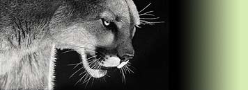
Photographing Scratchboard Works
Fairly often I get questions on how I get such good photos of my scratchboard. Although I own many expensive lenses for my expensive camera, I actually use a fairly inexpensive lens to photograph my work. I use a canon 50mm f/1.8 lens, which can be purchased for around $100. It will fit any canon DSLR body.
Next thing is I only photograph with natural light and I photograph in the shade or on bright overcast days. Photographing in the sun makes the work look too contrasty and brings out the shine of fingerprints and glare wherever you used the fiberglass brush. Even in the shade sometimes you will get a bit of glare, but it tends to be much worse in bright sunlight.
Next I set my exposure for the darks, rather than the lights. This usually means underexposing by about 2/3 of a stop to 1 full stop. I then try to shoot at about the same level and angle as the piece, so that it will be almost square within the image and GET CLOSE. I want my artwork to mostly fill the frame.

After I take my photos I choose which one looks the best/sharpest on the card and open it into photoshop. I have photoshop 3, and even if you don't have it most photo editing programs have pretty similar features. After the file is opened I crop the image. If I did not take my photograph perfectly square (which I usually don't) some things will look too wide/narrow, at a slight angle, etc. So when cropping have it so that each edge is being touched at the widest point. From here you will adjust the image. I adjust this by using free transform (ctrl+t) tool. The primary one I use within free transform is skew, which lets you adjust the corners both out and up or down. I use that to square up the corners and adjust everything to make it the right size.

From that point I then adjust the contrast with level. I make sure to get the whites back to white and the darks dark. Ampersand scratchboard is not pitch black, but rather a matte black, so sometimes taking that dark slider too far you will loose subtle midtones. Next I desaturate black and white images. This gets rid of any color cast. If the image is color I will adjust the color sliders until I get it close to the right colors. If the image is black and white I go into the color sliders and adjust the yellow in the highlight spectrum to about -4 (toward the yellow) since the clay has a slight warm cast to it. Here is my edited image once I am done.

For each image I spend maybe 3-5 minutes working on it to get it square and contrast about right.